Read Our Blogs

The Importance of UI/UX in Modern Web Development
In today’s digital-first world, your website is often the first impression your audience gets of your brand. But here’s the truth — no matter how powerful your backend or how unique your idea, a poorly designed user interface (UI) or confusing user experience (UX) can drive visitors away in seconds. That’s why UI/UX design has become a core pillar of modern web development. It’s not just about how your website looks — it’s about how it feels to use.
In this blog, we will explore the Importance of UI/UX in Modern Web Development.
What Is UI and UX?
- Before diving deeper, let’s clear up what these two terms actually mean:
- UI (User Interface) refers to the visual elements of a website — the layout, buttons, typography, color schemes, icons, and overall aesthetic that users interact with.
- UX (User Experience) focuses on how users feel when they use your website — how easy it is to navigate, how quickly they can find information, and how intuitive the overall flow is.
Why UI/UX Matters in Web Development?
- 1. First Impressions Are Everything
Studies show that users form an opinion about a website in less than 0.05 seconds. A visually appealing and well-structured UI immediately builds trust, while a cluttered or outdated design can make users leave instantly. - 2. Enhances Usability and Accessibility
Good UX ensures your website is easy to use for everyone — including people with disabilities. Simple navigation, readable fonts, and clear content hierarchy help users find what they need without frustration. - 3. Boosts Conversion Rates
A smooth, engaging experience guides visitors toward taking action — whether it’s making a purchase, signing up for a newsletter, or filling out a form. Better UX = better conversions. - 4. Strengthens Brand Identity
Your website’s design reflects your brand personality. Consistent colors, fonts, and design elements make your brand memorable and professional, helping you stand out in a crowded digital space. - 5. Improves SEO Performance
Search engines like Google now factor in user experience signals — like mobile responsiveness, page load speed, and time on site — when ranking websites. So, great UX doesn’t just please your visitors; it pleases search engines too.
Key Principles of Good UI/UX Design
- Simplicity: Keep designs clean and clutter-free.
- Consistency: Use consistent design elements and navigation throughout.
- Feedback: Give users clear feedback for their actions (e.g., button clicks, form submissions).
- Mobile-First Design: Ensure your website looks and works perfectly on mobile devices.
- Accessibility: Design for everyone, including users with disabilities.
UI/UX and Web Developers: A Perfect Partnership
Modern web development isn’t just about coding — it’s about collaboration. Developers, designers, and product managers must work together to ensure the final product is not only functional but delightful to use.
When developers understand UI/UX principles, they can create interfaces that are faster, cleaner, and more intuitive. This results in websites that people love to use — not just tolerate.
UI/UX design is no longer optional — it is essential. A website that combines beautiful visuals with seamless usability creates trust, boosts engagement, and drives long-term success.
Build Your Digital Presence with EFD Web Development
Best Wishes
EFD Group
Division | Web Development
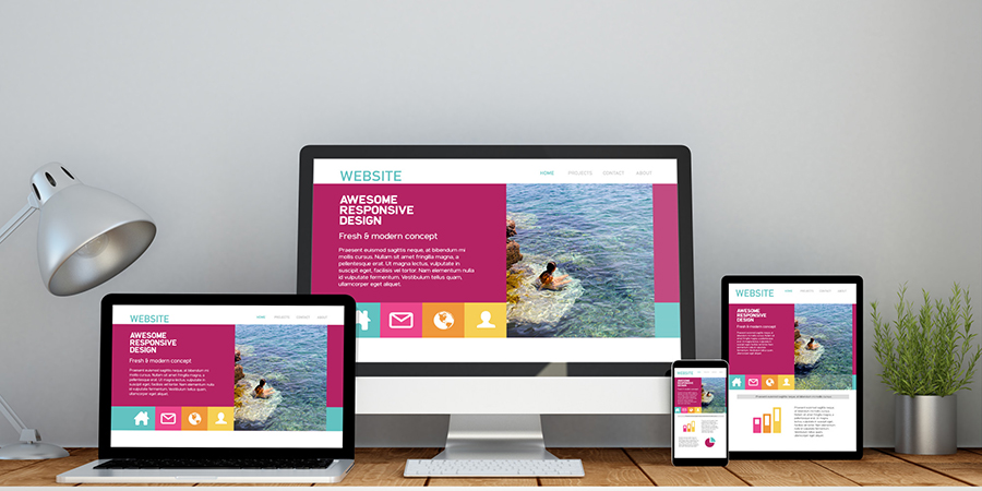
How to Create a Responsive Website Using Flexbox and Grid
In the digital age, users visit websites from all kinds of devices— phones, tablets, laptops, and desktops. That’s why creating a responsive website is essential. A responsive design ensures your layout adjusts gracefully to any screen size, offering a seamless experience across all devices. Two modern CSS tools that help achieve this are Flexbox and CSS Grid.
In this blog, we will explore how you can use them together to build modern, mobile-friendly websites.
What is Responsive Design?
Responsive design is all about adapting your layout to the screen it is being viewed on. Instead of creating different versions of your site for mobile and desktop, you build one layout that adjusts automatically.
Flexbox vs Grid – What is the Difference?
- Both Flexbox and Grid are layout systems in CSS, but they solve slightly different problems:
- Flexbox is best for one-dimensional layouts — arranging items in a row or a column.
- Grid is better for two-dimensional layouts, where you need control over both rows and columns at once.
You can use them individually or together depending on your design needs.
When to Use Flexbox?
- Flexbox is perfect for:
- Navigation bars
- Horizontal or vertical centering
- Spacing between buttons or icons
- Arranging items in a single row or column (like a product list)
It is flexible (as the name suggests), and it shines when content needs to adjust its size dynamically.
When to Use Grid?
- Grid is ideal for:
- Page layouts (like header, sidebar, content, footer)
- Image galleries
- Complex forms
- Responsive sections with both rows and columns
With Grid, you can create powerful layouts without relying on float hacks or external frameworks.
Combining Flexbox and Grid
- Many modern websites use both Flexbox and Grid together. A common approach is:
- Use CSS Grid to define the overall page structure (header, nav, main content, footer).
- Use Flexbox inside components for smaller, one-dimensional layouts (like aligning buttons or centering content).
This combo gives you maximum control and flexibility.
Making It Responsive
- Once you have built your layout using Flexbox and Grid, you can add media queries to make it responsive. Media queries let you define different styles for different screen sizes — for example:
- Show a sidebar only on large screens
- Stack elements vertically on mobile
- Resize images or text based on screen width
The key is to follow a mobile-first approach, starting with styles for smaller screens and building up for larger devices.
Flexbox and Grid are game-changers in modern web design. They give you the power to create clean, responsive layouts with less code and more control. By understanding when and how to use each, you’ll be able to build websites that look great on any device and provide a better experience for every user.
Build Your Digital Presence with EFD Web Development
Best Wishes
EFD Group
Division | Web Development
The Power of Bootstrap in Modern Web Development
In today’s fast-paced digital world, speed, responsiveness, and consistency are everything. Whether you're building a personal portfolio, an admin dashboard, or a complex web app, users expect a seamless experience across all devices. That’s where Bootstrap comes in a powerful front-end framework that has transformed modern web development.
What Is Bootstrap?
Bootstrap is a popular open-source front-end toolkit developed by Twitter. It provides developers with a set of ready-to-use components, responsive grid systems, and predefined styles to build beautiful and functional websites quickly.
From navigation bars to modals, buttons to carousels — Bootstrap handles it all with minimal custom code, making it a go-to choice for developers and businesses alike.
Why Bootstrap Still Matters in 2025?
1. Faster Development Time
Bootstrap’s prebuilt components and extensive documentation help developers move fast without compromising quality. You don’t have to write CSS from scratch or worry about browser inconsistencies — Bootstrap handles it.
2. Mobile-First & Responsive by Default
Bootstrap is built on a mobile-first approach, ensuring that your website looks great on smartphones, tablets, laptops, and desktops right out of the box. The responsive grid system is intuitive and flexible for any layout design.
3. Consistent Design Language
Whether you are working solo or in a team, Bootstrap ensures a consistent design across your entire project. With its standardized classes and components, everyone stays on the same page.
4. Customizable & Scalable
You can easily customize Bootstrap to suit your brand or design needs. From changing color schemes to overriding styles with your own CSS, Bootstrap gives you control while providing structure.
5. Cross-Browser Compatibility
One of the biggest headaches in web development is ensuring your site works across browsers. Bootstrap handles this for you, ensuring your site looks and functions properly on Chrome, Firefox, Safari, and Edge.
6. Large Community & Ecosystem
Bootstrap has one of the largest developer communities in the world. This means you get access to tons of third-party themes, plugins, and templates — not to mention helpful forums and tutorials.
Common Use Cases of Bootstrap
- Landing Pages
- Admin Dashboards
- Portfolio Websites
- E-commerce Front Ends
- Login/Signup Pages
- Company Websites
From startups to enterprise-level apps, Bootstrap is everywhere.
Bootstrap vs Other Frameworks
- There are newer tools like Tailwind CSS and Material UI, but Bootstrap remains relevant because of:
- Simplicity
- Fast learning curve
- Full component library
- Fewer dependencies
While utility-first frameworks like Tailwind give more control, Bootstrap wins when you need speed, structure, and a plug-and-play system.
Bootstrap continues to be a powerful ally in modern web development. Its ease of use, responsive capabilities, and consistency make it an excellent choice for both beginners and professionals. Whether you're building a quick MVP or scaling a business website, Bootstrap helps you build fast, look good, and launch confidently.
Build Your Digital Presence with EFD Web Development
Best Wishes
EFD Group
Division | Web Development
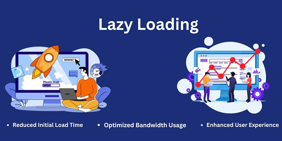
Lazy Loading Images: What, Why & How?
When it comes to building fast, user-friendly websites, images often play a big role in slowing things down. But there’s a simple solution to help speed things up without sacrificing visual quality — lazy loading images.
In this post, we will explain What lazy loading is, Why it's important & How to easily implement it on your website
What is Lazy Loading?
Lazy loading is a technique that delays the loading of images until they are needed — typically when they’re just about to appear on a user’s screen.
Instead of loading every image on the page when it first opens (even the ones at the bottom that users might never scroll to), lazy loading waits until the user scrolls down to that part of the page. Only then does the image load.
Think of it like this:
You don’t turn on all the lights in your house at once — you turn them on only when you enter a room. That’s exactly how lazy loading works for images.
Why Should You Use Lazy Loading?
Lazy loading is not just a fancy trick — it has real benefits for your website performance and your visitors’ experience.
1. Faster Page Load Times:
Pages load quicker when fewer images load at the start. This makes your site feel smoother and more responsive.
2. Better User Experience:
Nobody likes waiting for a website to load. Lazy loading helps pages become interactive faster, which keeps visitors engaged
3. Saves Data for Mobile Users:
Visitors on mobile networks or limited data plans don’t have to download every image — only the ones they actually view.
4. Improves SEO:
Google favors websites that load quickly and offer a good user experience. Lazy loading can help improve your site’s rankings in search results.
How to Implement Lazy Loading?
There are a few ways to add lazy loading to your website, and the good news is — it’s easier than ever.
1. Use Built-In Features:
Many website platforms (like WordPress, Shopify, or Wix) have lazy loading built in. Check your settings or themes — it may already be turned on!
2. Use a Plugin:
If your platform does not support lazy loading out of the box, you can install a plugin or extension. There are many free and paid options available that handle all the work for you.
3. Talk to Your Developer:
If you work with a developer, ask them to add lazy loading for your images. It’s a small change that can make a big difference.
Best Practices for Lazy Loading
- Use clear image sizes to avoid page layout shifting.
- Add placeholder images or subtle animations while the real image loads.
- Test your site speed after enabling lazy loading to see the improvement.
Lazy loading images is a simple but powerful way to speed up your website, improve user experience, and boost your SEO. Whether you are running a blog, an online store, or a business site, it’s a smart move that pays off.
If you have not already, take a few minutes to set it up — your visitors (and your search rankings) will thank you.
Build Your Digital Presence with EFD Web Development
Best Wishes
EFD Group
Division | Web Development
How to Choose the Right CMS for Your Business?
When building a professional website, one of the most critical decisions you'll make is choosing the right Content Management System (CMS). The CMS you select can impact your website’s performance, scalability, SEO, design flexibility, and even your day-to-day operations.
With so many CMS options available—like WordPress, Shopify, Webflow, Wix, Joomla, Magento, Drupal, and others—it can be overwhelming to choose the best one for your business.
In this blog, we will break down what a CMS is, why it matters, and how to choose the right CMS for your specific needs.
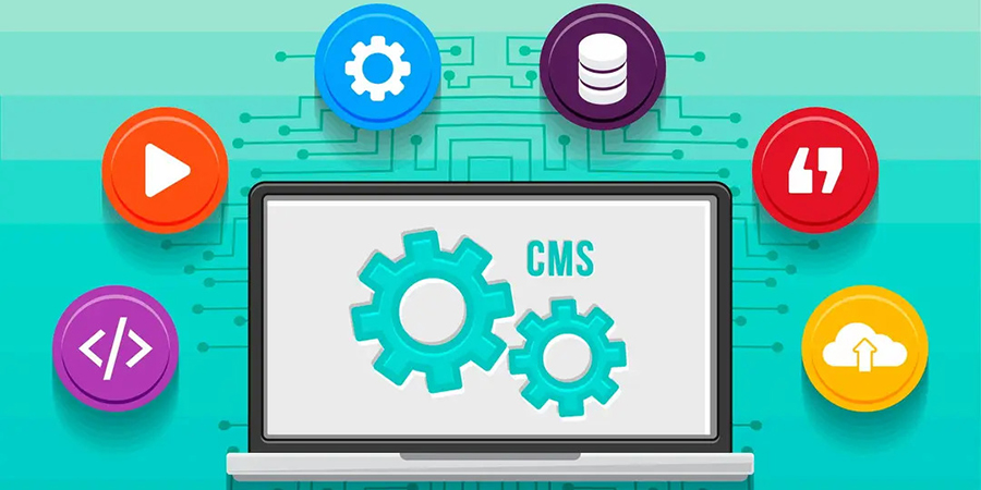
What Is a CMS?
A Content Management System (CMS) is a software platform that allows you to create, manage, and modify digital content on a website without needing to write code from scratch. Think of it as the "backend" of your website—the place where you log in, upload content, publish blog posts, update pages, and manage design elements.
Why Choosing the Right CMS Matters?
- The CMS you choose affects:
- Website speed and performance
- Security and data protection
- SEO capabilities
- User experience and design flexibility
- Integration with third-party tools
- Cost of setup and maintenance
- Ease of scaling as your business grows
Key Factors to Consider When Choosing a CMS
1. Your Business Goals
- Are you building:
- A blog or content-driven site?
- An e-commerce store?
- A portfolio or personal brand?
- A corporate or service-based site? Your end goal determines which CMS features are essential.
Example: Shopify is excellent for e-commerce, while WordPress is ideal for content-heavy sites.
2. Ease of Use
Do you or your team have technical experience? Some CMS platforms are beginner-friendly, while others require developer skills.
| CMS | Ease of Use | Tech Skill Needed |
|---|---|---|
| WordPress | Moderate | Low to Medium |
| Wix | Easy | None |
| Webflow | Moderate | Medium |
| Shopify | Easy | None |
| Drupal | Hard | High |
| Joomla | Moderate | Medium |
An optimized site is the difference between a bounce and a sale.
3. Scalability
Choose a CMS that can grow with your business. If you are planning to expand your site with more pages, features, or traffic, make sure the platform can handle that.
Tip: WordPress and Drupal are highly scalable for larger projects.
4. Security
Look for a CMS with strong security features, regular updates, and community or developer support. E-commerce sites must ensure PCI compliance and customer data protection.
5. Budget
- Different CMS platforms come with different costs:
- Open-source CMS like WordPress or Joomla are free but require hosting and possible plugin/theme purchases.
- Hosted CMS like Wix or Shopify include hosting but charge monthly fees.
6. SEO Features
- Different CMS platforms come with different costs:
- Customizable meta tags
- Clean URLs
- Image optimization
- Fast loading speed
- Mobile responsiveness
Top SEO-friendly CMSs: WordPress, Webflow, Shopify (with apps), and Joomla.
7. Integration & Plugins
- Make sure your CMS supports integration with:
- Email marketing tools (Mailchimp, ConvertKit)
- CRMs (HubSpot, Salesforce)
- Payment gateways (PayPal, Stripe)
- Analytics tools (Google Analytics, Hotjar)
WordPress has 55,000+ plugins, making it the most customizable.
There is no one-size-fits-all answer. The best CMS depends on your business goals, budget, technical skills, and future growth plans.
Build Your Digital Presence with EFD Web Development
Best Wishes
EFD Group
Division | Web Development
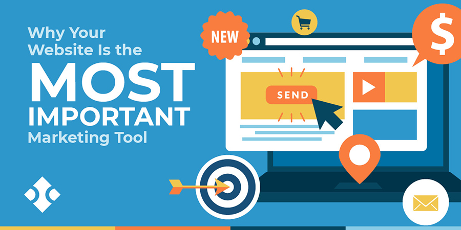
Why Your Website Is the Most Important Part of Your Marketing?
In today’s digital-first world, your website is no longer just a digital business card — it is the foundation of your brand, your most powerful marketing asset, and often your first (and only) chance to make an impression.
Whether you are running a local business or a global brand, your website is where your customers land, learn, and ultimately decide to trust you.
Let’s break down why your website is the heart of your marketing strategy:
1. It’s Your 24/7 Salesperson
Unlike your team, your website never sleeps. It's available 24/7, helping potential customers learn about your services, explore your products, and contact you — even when you're offline.
A well-optimized website works around the clock to convert visitors into leads and leads into loyal customers.
2. First Impressions Happen Here
Most people will discover your business online first — through a Google search, a social media link, or an ad. And what do they do next? They check your website.
In just a few seconds, visitors will decide if you're trustworthy, professional, and worth their time. A modern, clean, fast, and mobile-friendly site instantly builds credibility. An outdated or broken one? That does the opposite.
3. It is the Core of All Marketing Channels
- Whether you’re investing in:
- SEO
- Google Ads
- Email marketing
- Social media
- Influencer campaigns
- Offline promotions ..all of them lead back to your website.
That makes your site the central hub of your entire marketing ecosystem.
4. It Drives Conversions
Your marketing campaigns might attract visitors — but your website turns them into paying customers. Clear calls-to-action (CTAs), well-placed forms, chatbots, and simple navigation all guide users to take action.
An optimized site is the difference between a bounce and a sale.
5. Mobile Experience Is Non-Negotiable
Over 60% of internet traffic is now on mobile. If your website isn’t responsive and user-friendly on phones or tablets, you’re losing business — period.
Responsive design is no longer a feature — it’s a requirement.
6. It’s Measurable & Testable
- Unlike traditional marketing, your website performance is fully trackable. With tools like Google Analytics, Hotjar, and Search Console, you can see:
- Where users come from
- What they click on
- Where they drop off
- What content converts best
This data helps you fine-tune your marketing strategy in real time.
7. It Builds Brand Trust
- A strong website reflects a strong brand. With the right visuals, tone, and user experience, your site tells visitors:
- Where users come from
- What they click on
- Where they drop off
- What content converts best
Trust builds loyalty — and loyalty drives growth.
8. It is Your Competitive Advantage
In a world where everyone has a presence online, your website can set you apart. With custom design, faster load times, better content, and smart UX — your site becomes more than just a page, it becomes a powerful business tool.
A better website = a better impression = more business.
9. It's Scalable and Adaptable
Unlike printed materials or ads, your website can evolve with your business. Want to launch a new service? Add a landing page. Running a sale? Add a banner. Shifting your strategy? Update your messaging.
Your website grows as your business grows.
10. It’s the Foundation of Digital Credibility
Today, people judge your credibility by your website. No site or a poorly designed one can raise doubts about your legitimacy. A clean, professional, up-to-date site shows you care about your brand — and your customers.
Your website is not just part of your marketing — it is your marketing. Every campaign you run eventually leads users back to your site. If it does not deliver a great experience, nothing else will matter.
Build Your Digital Presence with EFD Web Development
Best Wishes
EFD Group
Division | Web Development

Common Mistakes New Web Developers Make (and How to Avoid Them)
Breaking into web development is exciting. You are learning new skills, building things that work in the browser, and maybe even getting paid to do it. But as with any craft, the early stages come with a learning curve—and a few common mistakes.
In this post, we will walk through the most frequent pitfalls new web developers encounter—and more importantly, how to avoid them.
Let’s dive into the common mistakes new web developers make (and how to avoid them):
1. Focusing Too Much on Tools, Not Fundamentals
The Mistake:
New devs often chase the latest frameworks, tools, and libraries—React one week, Vue the next, Tailwind the week after. While tools are helpful, they’re not a substitute for strong fundamentals.
The Fix:
Master the basics first: HTML for structure, CSS for styling, and JavaScript for interactivity.
Once you understand the “why” behind the code, you’ll be better equipped to use any framework effectively.
2. Not Writing Semantic HTML
The Mistake:
Using div and span for everything instead of proper HTML tags like header, article, or section.
The Fix:
Use semantic HTML to improve accessibility, SEO, and readability. Tools like HTML5 Outliner can help visualize document structure.
3. Skipping Responsive Design
The Mistake:
Designing only for desktop and ignoring how your site looks on tablets or phones.
The Fix:
Use media queries, flexbox, and CSS grid to create layouts that adapt to screen sizes. Test your site on multiple devices or simulators early and often.
4. Copy-Pasting Code Without Understanding It
The Mistake:
Grabbing solutions from Stack Overflow or ChatGPT without reading or learning how it works.
The Fix:
Always make an effort to understand what the code is doing. Ask yourself questions like: What problem is this solving? Could I write this myself? Are there better or simpler alternatives? This approach helps you learn more effectively and become a stronger developer over time.
5. Poor File & Project Organization
The Mistake:
All your files are dumped into one folder with vague names like file1.html or mainfinalv3.js.
The Fix:
Adopt clear naming and folder conventions. As projects grow, clean organization helps you (and others) work faster and avoid confusion.
6. Ignoring Version Control (Git)
The Mistake:
Not using Git until something goes wrong or worse, never using it at all.
The Fix:
Learn the basic Git commands and workflows to manage your code effectively. Start with essential commands like git init, git add, and git commit, then move on to concepts like branching and understanding GitHub basics. These skills are crucial for version control and collaborating on projects.
Version control is your safety net. Use it early and often, even for small projects.
7. Overengineering Simple Projects
The Mistake:
Using a full React or backend framework for a simple static page.
The Fix:
Match your tools to the project’s needs. A landing page doesn’t need a full frontend framework. Sometimes, HTML + CSS + a little JS is all you need.
8. Not Testing Enough
The Mistake:
Assuming your site works just because it loads in your browser.
The Fix:
Make sure to test your website across multiple browsers like Chrome, Firefox, and Safari to ensure consistent performance. It's also important to check how your site looks and functions on different devices or use developer tools to simulate various screen sizes. As your projects grow, consider adding basic unit tests or end-to-end testing to catch bugs early and maintain reliability.
9. Neglecting Accessibility (a11y)
The Mistake:
Building interfaces that look great—but aren’t usable for everyone, especially those with disabilities.
The Fix:
Start small by using proper HTML elements and adding alt text to images for better accessibility. Test keyboard navigation to ensure your site is usable without a mouse, and use tools like Lighthouse or axe DevTools to audit and improve your site’s accessibility.
Accessibility isn't just "nice to have"—it's essential.
10. Giving Up Too Soon
The Mistake:
Feeling overwhelmed by the sheer amount of things to learn and thinking “I’m not cut out for this.”
The Fix:
Web development is a vast field, but you don’t need to learn everything all at once. Instead, focus on one concept at a time, build small projects to apply what you have learned, and seek feedback to improve through iteration.
Everyone struggles in the beginning. Persistence beats perfection.
Making mistakes is part of the learning process. In fact, it’s how you grow. But by recognizing these common pitfalls early, you can speed up your progress and become a more confident, effective web developer.
Build Your Digital Presence with EFD Web Development
Best Wishes
EFD Group
Division | Web Development
Top 10 Free Tools Every New Web Developer Should Use
Starting out in web development? The good news is you don’t need to invest in expensive software or platforms to get going. There are plenty of powerful and free tools that can help you code, design, debug, and deploy websites with ease.
Whether you’re learning the ropes or working on your first few projects, these tools will supercharge your workflow and help you become a more efficient, confident developer.
Let’s dive into the Top 10 free tools every new web developer should use:
1. Visual Studio Code (VS Code)
A lightweight yet powerful code editor developed by Microsoft. It supports multiple languages, has a huge extension library, and includes built-in Git support.
Best for: Writing, editing, and managing code
2. GitHub
GitHub is the world’s most popular platform for version control using Git. It’s where you store your code, collaborate with others, and manage open-source or personal projects.
Best for: Code collaboration and version control
3. CodePen
An online playground for HTML, CSS, and JavaScript. Perfect for quick experiments, animations, and front-end prototypes you can instantly preview in the browser.
Best for: Rapid prototyping and learning front-end
4. FreeCodeCamp
A completely free online platform offering coding lessons, projects, and certifications in web development and more.
Best for: Learning web development step by step
5. Google Chrome DevTools
Built into every Chrome browser, DevTools let you inspect, edit, and debug your website in real time. You can also test responsiveness and performance.
Best for: Debugging and testing in-browser
6. Figma
A free collaborative design tool for wireframing, UI/UX design, and prototyping. It’s especially useful when working with designers or planning layout structure.
Best for: Designing and collaborating on web layouts
7. Netlify
A simple and powerful hosting platform for static websites. With drag-and-drop deployment, Git integration, and free SSL, it's a top choice for front-end developers.
Best for: Hosting your web projects for free
8. W3Schools & MDN Web Docs
Two of the most trusted learning resources for developers. W3Schools is beginner-friendly, while MDN Web Docs (by Mozilla) offers in-depth, reliable documentation.
Best for: Learning syntax and finding quick references
9. Canva
While not strictly for developers, Canva is a great free tool for quickly creating visuals, banners, and mockups without needing advanced design skills.
Best for: Creating website graphics and marketing materials
10. Stack Overflow
Every developer’s best friend. Chances are, if you run into a coding problem, someone has asked (and answered) it on Stack Overflow.
Best for: Troubleshooting and finding coding solutions
Starting with the right set of tools can make a huge difference in how fast you learn and how confidently you build. These 10 tools are free, beginner-friendly, and widely used in the industry—so you are setting yourself up for success from day one.
Build Your Digital Presence with EFD Web Development
Best Wishes
EFD Group
Division | Web Development

The Future of Web Development: Trends to Watch in 2025
Web development is evolving faster than ever. From AI-powered interfaces to immersive user experiences, developers are pushing boundaries and redefining what’s possible online. In this post, we’ll explore the top trends shaping the future of web development—and how you can stay ahead of the curve.
Top 7 Digital Marketing Strategies:
1. AI & Automation in Web Design
Artificial intelligence is no longer just a buzzword. Tools like Copilot and ChatGPT are helping developers write cleaner code, generate content, and even design layouts.
2. Mobile-First & Responsive Design
With mobile traffic dominating the web, responsive design isn’t optional—it’s essential. Frameworks like Bootstrap and Tailwind CSS make it easier than ever to build fluid, mobile-friendly layouts.
3. Progressive Web Apps (PWAs)
PWAs combine the best of web and mobile apps. They’re fast, reliable, and work offline—perfect for users in low-connectivity areas.
4. Motion UI & Microinteractions
Subtle animations and transitions can elevate the user experience. Motion UI libraries help you add flair without sacrificing performance.
5. Accessibility & Inclusive Design
Designing for everyone isn’t just ethical—it’s smart. Accessible websites reach wider audiences and perform better in search rankings.
6. Jamstack & Headless Architecture
Modern web development is moving toward Jamstack and headless CMS tools like Strapi or Contentful—offering faster load times, better scalability, and stronger security by separating frontend from backend.
Web development is more than just code—it’s about crafting experiences. Whether you're a seasoned developer or just starting out, staying curious and adaptable is key. Keep learning, keep building, and keep pushing the web forward.
Build Your Digital Presence with EFD Web Development
Best Wishes
EFD Group
Division | Web Development

Top 7 Digital Marketing Strategies Every Business Needs in 2025
Stay ahead in the ever-evolving world of digital marketing with our expert insights, tips, and strategies. Whether you’re a business owner, marketer, or enthusiast, our blog covers everything from SEO and social media trends to content marketing and paid advertising. We’re here to help you navigate the digital landscape, grow your online presence, and turn clicks into customers. Dive into our latest articles and discover practical advice that you can apply to boost your brand and achieve real results.
Top 7 Digital Marketing Strategies:
1. AI-Powered Personalization
EFD Group uses AI to create personalized campaigns that boost engagement and drive results.
2. Voice Search Optimization
EFD Group optimizes content for voice search, aligning with how users speak to Siri, Alexa, and Google Assistant.
3. Video Marketing Dominance
EFD Group crafts engaging video strategies—reels, tutorials, live streams—to boost brand recall and build trust.
4. Omnichannel Marketing
EFD Group ensures your brand message stays consistent across all platforms—social media, email, and search—for a seamless customer experience.
5. SEO with a Focus on E-E-A-T
SEO isn’t just about keywords—it’s about trust. EFD Group Digital Marketing builds content that reflects Experience, Expertise, Authoritativeness, and Trustworthiness (E-E-A-T), so your website ranks higher and earns credibility.
6. Influencer & Micro-Influencer Collaborations
Authenticity is everything in 2025. EFD Group Digital Marketing connects brands with influencers who align with their mission, ensuring organic growth and community trust.
7. First-Party Data Strategy
As privacy rules evolve, relying on third-party cookies is no longer an option. EFD Group Digital Marketing helps brands build and activate first-party data.